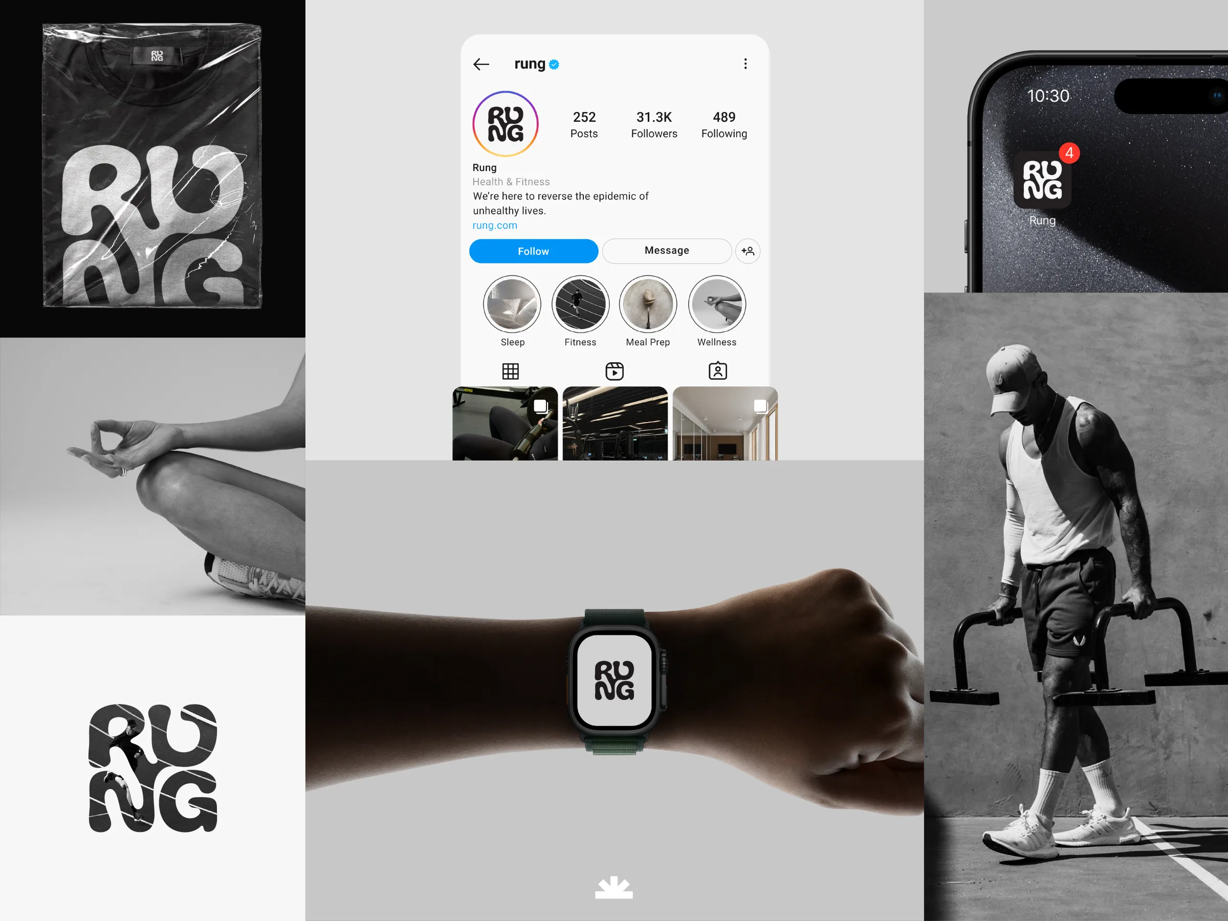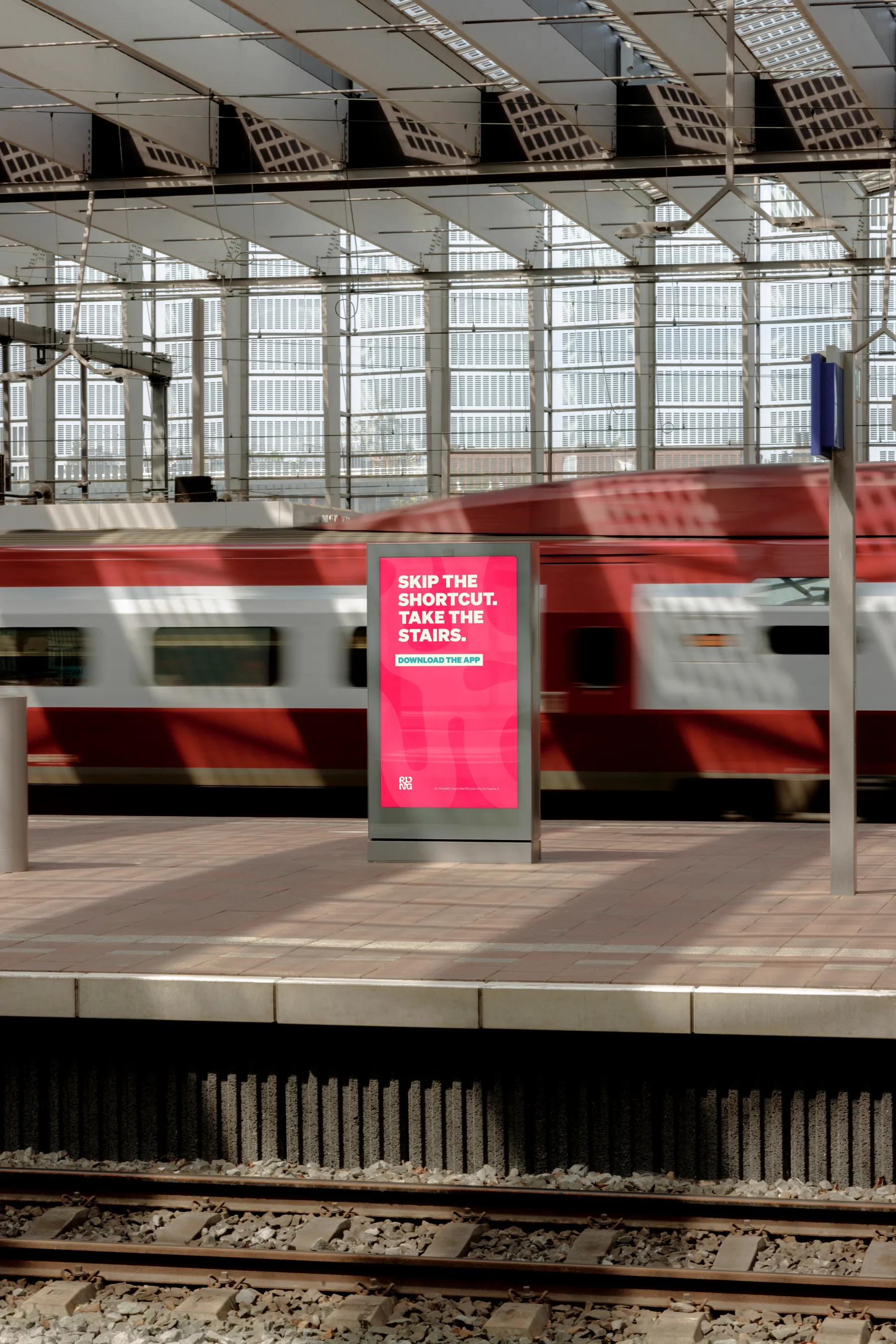
Rung needed a flexible identity system for a fitness app: a logo, colours, reusable icons and clear rules that could guide the app design. The goal was to create a brand that felt energetic, simple to apply and easy to keep consistent as the product grew.
The Project
We shaped the visual foundation for Rung so the app could be designed around a consistent set of rules. The work covered logo direction, colour choices, icon style and brand guidelines that explained how to use the identity across product screens, marketing and future assets.
Our Process
Direction
Defined a look that could feel active and modern without becoming hard to use.
Identity
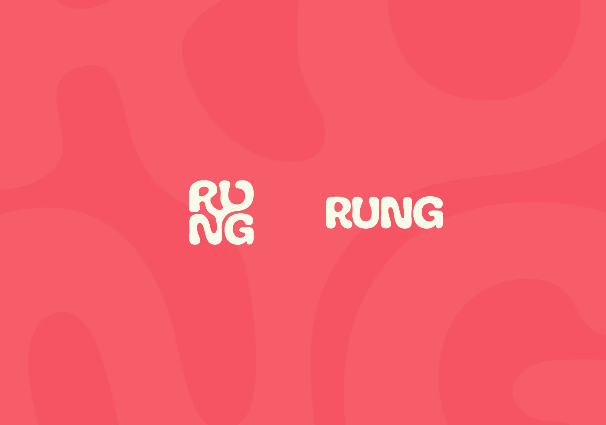
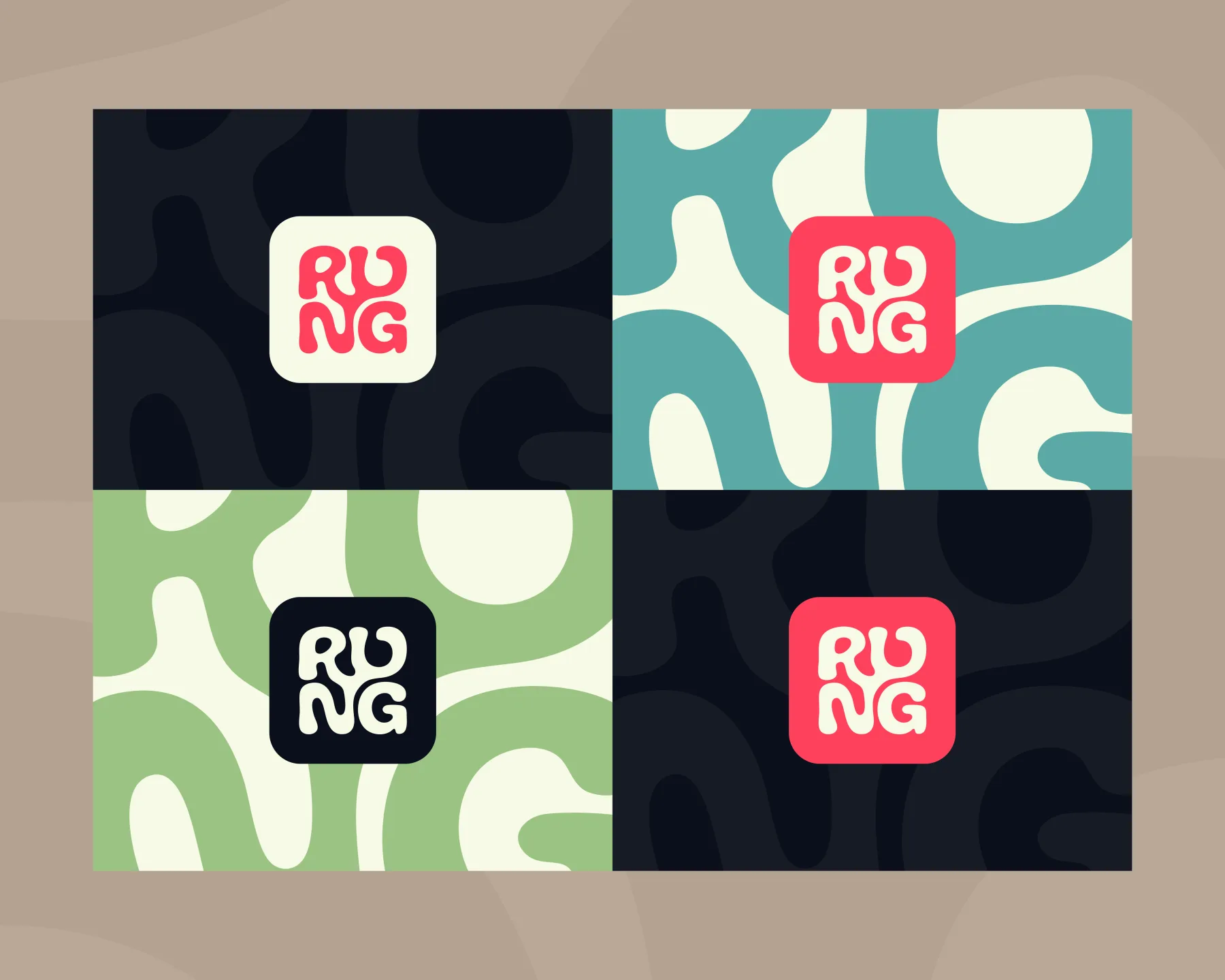
Created a flexible logo suite, colour palette and supporting icon approach.
Rules
Built clear guidance so future app screens and assets could stay consistent.
Application
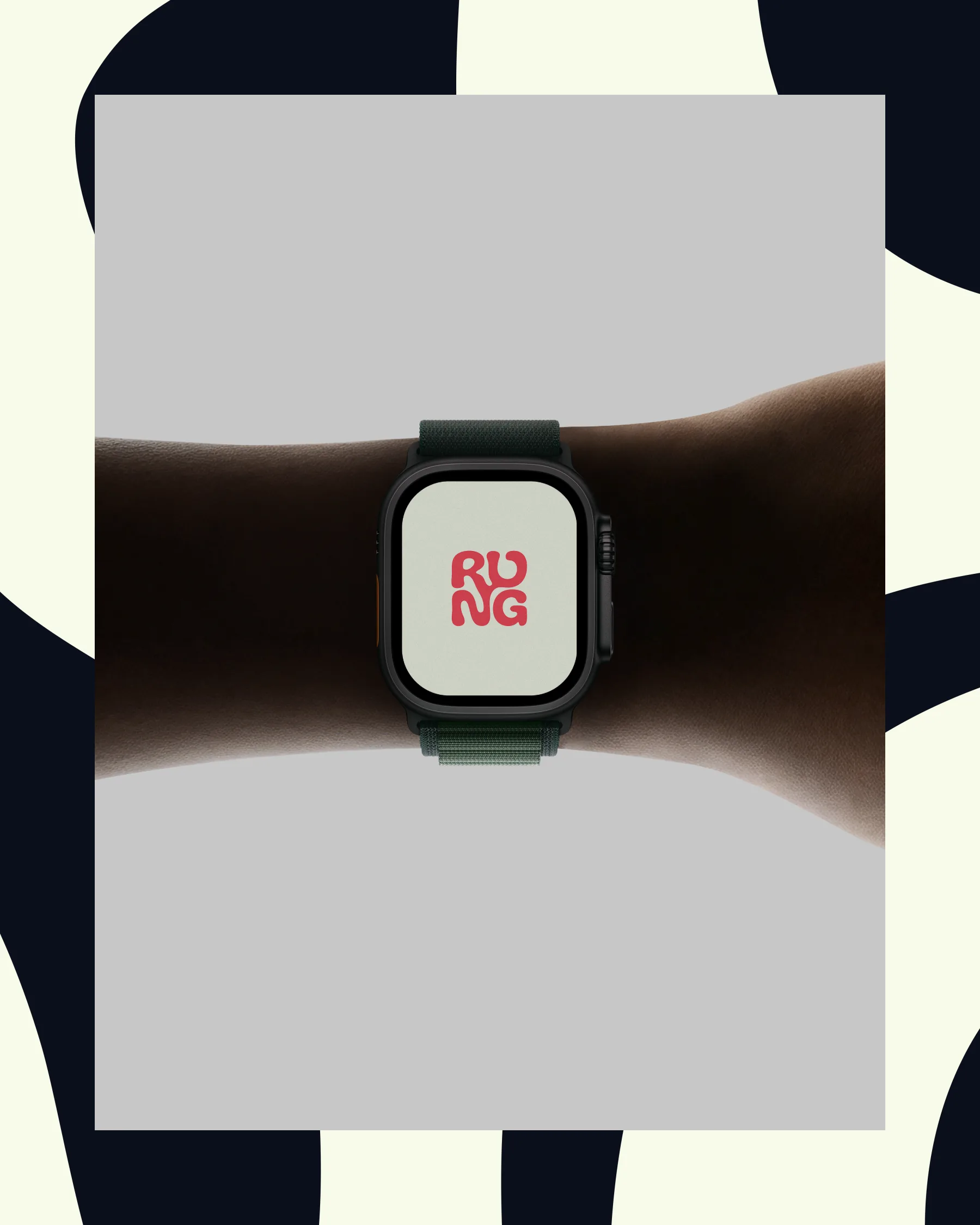
Prepared mockup thinking to show how the brand could carry through the product.