BrandingLogo DesignPrint DesignBusiness Cards
Lamu Massage needed a soft, natural identity that could work across client-facing materials. We created the logo, colour direction, brochures and business cards, giving the brand a warm and consistent visual feel.
The Project
The identity was designed to feel calm, grounded and approachable. Rather than a full guideline document, the project focused on practical brand assets: a logo, colour palette and printed materials that could be used straight away.
Our Process
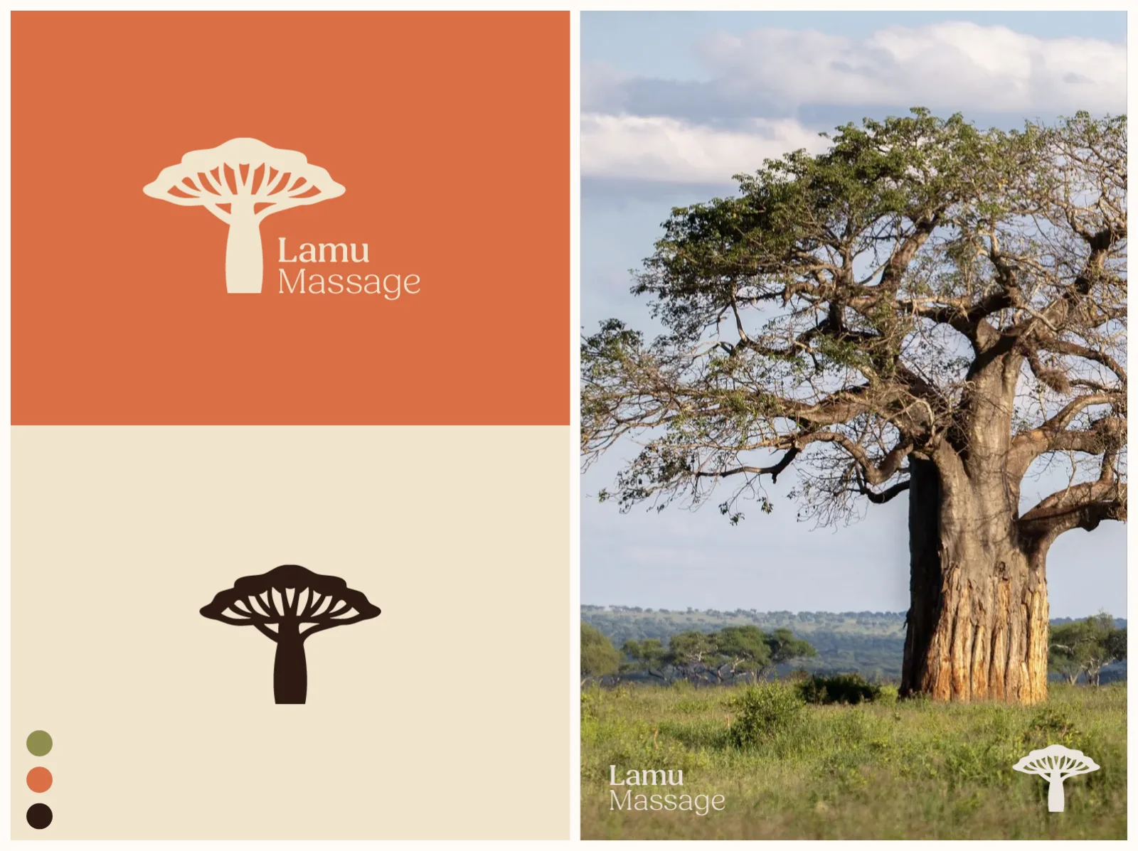
Visual Direction
Built a calm palette and natural tone for a wellness-led brand.
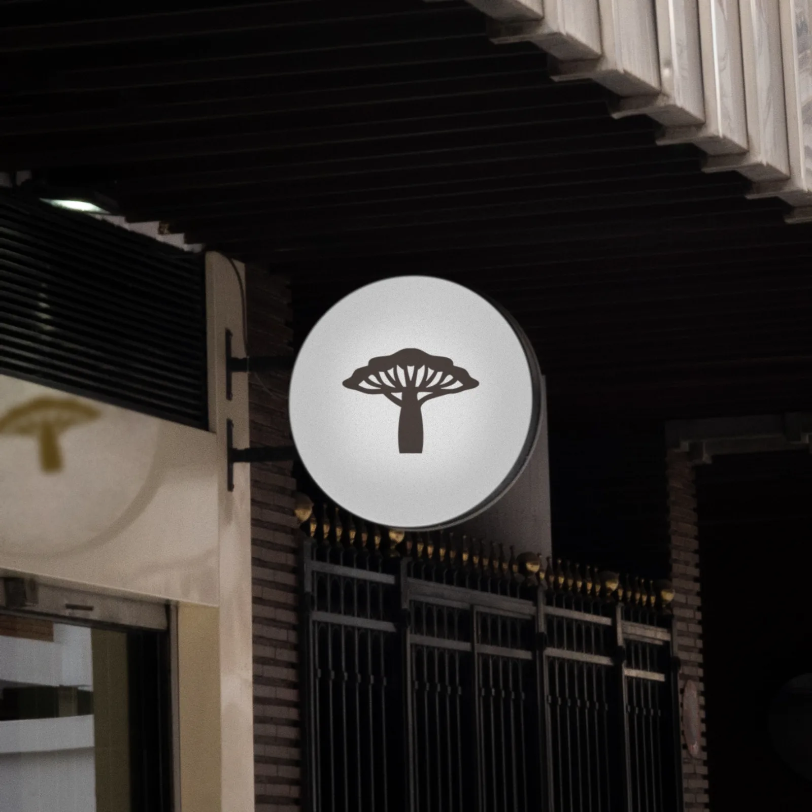
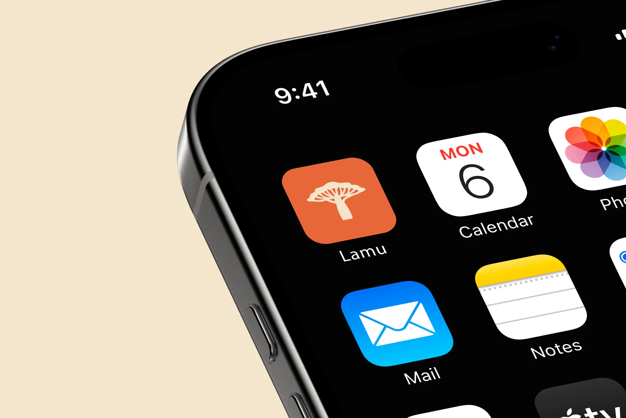
Logo
Created a mark that could work across digital and printed materials.
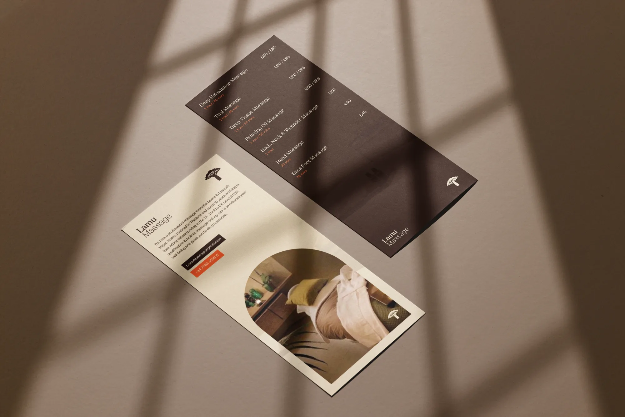
Designed brochures and cards to make the brand feel polished in person.
Consistency
Kept the look simple enough to apply across future materials.