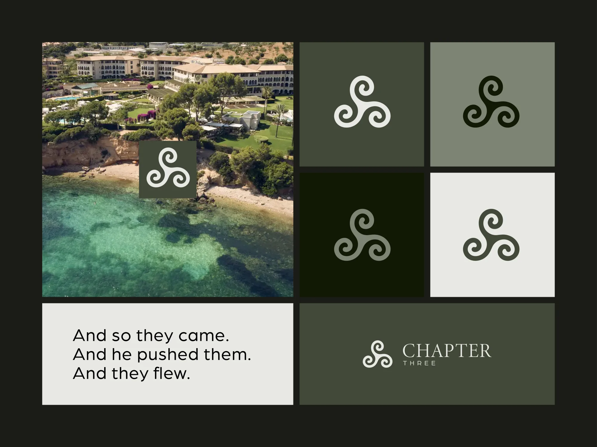
BrandingLogo DesignColour Direction
Chapter Three needed a professional identity that felt calm, considered and trustworthy. We created logo concepts and a colour direction that gave the coaching brand a softer, more confident visual presence.
The Project
The work focused on making the brand feel approachable and polished without looking clinical or overly corporate. The final direction gave Chapter Three a visual system that could work across digital touchpoints, printed material and future marketing.
Our Process
Tone
Defined a direction that felt calm, supportive and professional.
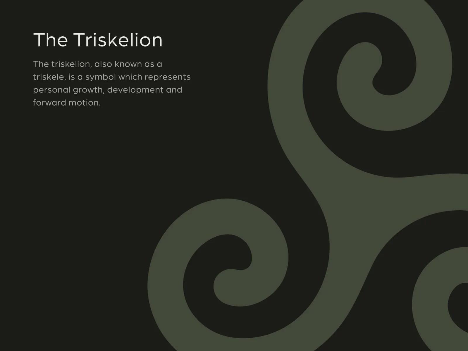
Logo
Explored logo forms that could feel confident without being loud.
Colour
Built a palette that supported the coaching brand’s softer positioning.
Application
Showed how the identity could work across brand and marketing assets.