The Project
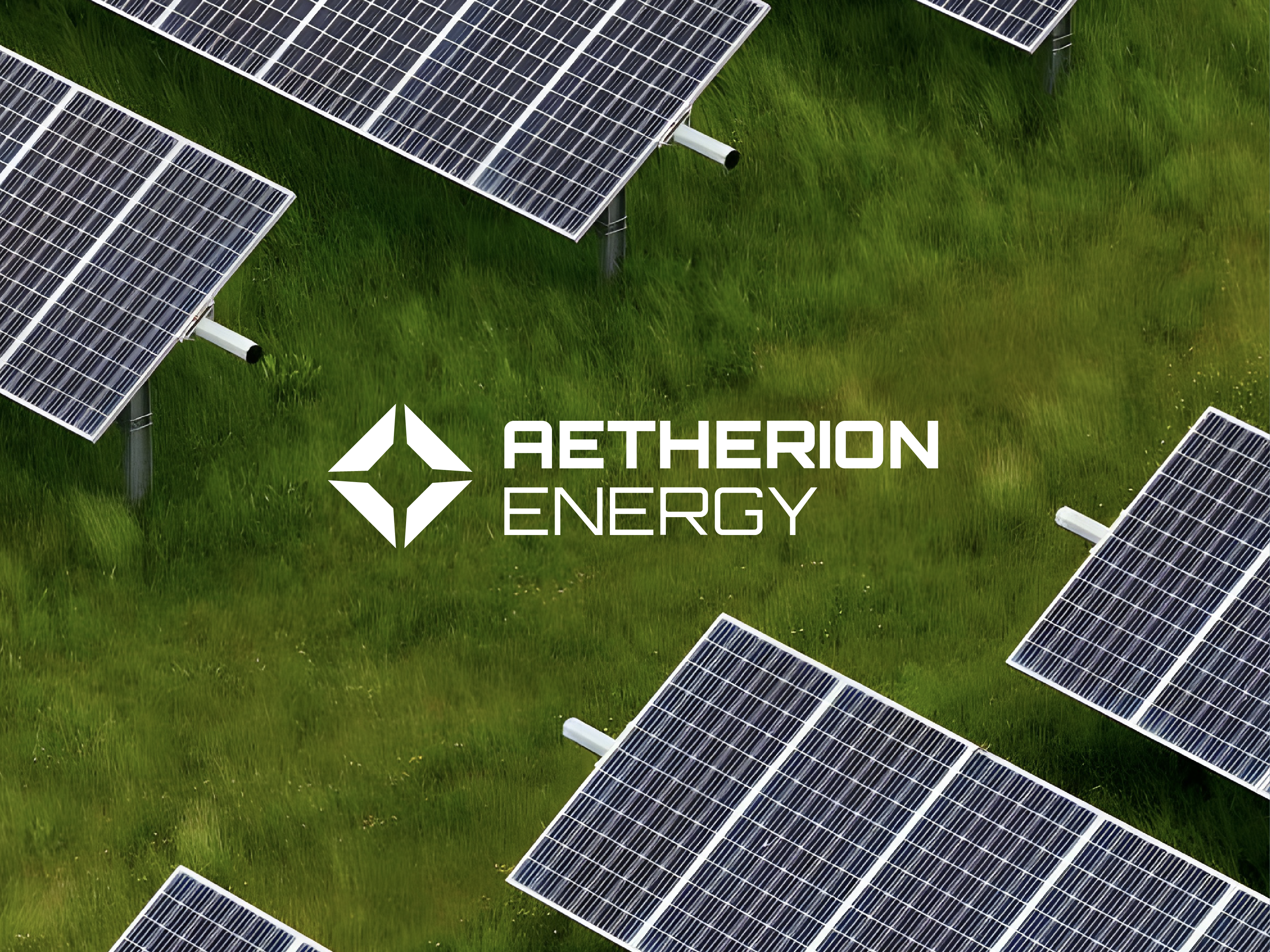
We created a bold, clean logo that brings together the two key elements of Aetherion’s work: drones and solar tech. The mark blends the silhouette of a drone with the geometry of solar cells — a subtle nod to their unique approach and the future-facing mindset of the brand.
- Logo Design: A sleek, modern identity that feels innovative, trustworthy, and ready to scale.
- Visual Language: We built out the full brand pack — from colour palette and type to icons — so everything feels cohesive across print, digital, and beyond.
- Brand Strategy: Helped position Aetherion as more than just a service — this is a brand built for the future of energy.
Our Process
From the first chat to the final tweaks, this project was super collaborative. We explored a few different directions, grounded in research and inspired by the tech-meets-nature vibe at the core of what Aetherion does. Matthew was involved every step of the way, and the end result is a brand that reflects exactly where the business is headed.
Research
Reviewed their services, mapped the booking/enquiry flow, and identified what users need to see first.
Structure & Clarity
Built a simple page structure with clear CTAs and an easy path from “what is this?” to “book now”.
Design & Build
Created a warm, clean visual system with responsive layouts that feel calm and readable on any device.
SEO & Launch
Optimised for local search intent, improved on-page fundamentals, and tested everything for a smooth launch.


